

Now Reading: Five countries had more women than men in parliament in 2025 – Our World in Data
- 01
Five countries had more women than men in parliament in 2025 – Our World in Data

Five countries had more women than men in parliament in 2025 – Our World in Data
September 05, 2026
Women’s representation in national politics has increased dramatically in the last century.
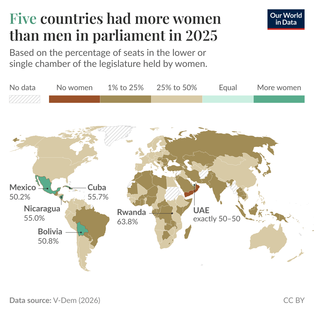
But men still hold more parliamentary seats in almost every country. There are five exceptions: Mexico, Cuba, Nicaragua, Bolivia, and Rwanda.
You can see this on the map. Most countries are in brown, meaning they have a higher share of men; in many countries, they make up more than 75% of the seats (shown in darker brown).
Look closely enough, and you can see the five countries in green that have more women.
This data comes from V-Dem and is based on parliamentary seats in 2025. It’s worth noting that members of parliament have varying levels of influence and power across countries.
Related topic pages:
Today
Max Roser and Pablo Arriagada
Economic growth is most important for the world's poorest people, and most of the world’s poorest live on the African continent. Are Africa’s economies growing?
The picture is mixed. In some countries, incomes have unfortunately declined in the last decades. This includes Madagascar, Zimbabwe, and Burundi. I have written about this in my brief explainer on extreme poverty.
In today’s Data Insight, I want to focus on the other side: I want to highlight the African countries that are achieving economic growth. Nine of them are shown in the chart above.
In all nine countries, people’s average incomes have more than doubled since 1990.
This made substantial improvements in living standards possible: the share of people in extreme poverty and the rate of child mortality declined in all nine countries.
September 3
Esteban Ortiz-Ospina
In 2024, around 18.5 million people born in India lived abroad. For the world’s most populous country, that’s not a lot: just over 1% of the population. This chart shows where they live, based on estimates from the UN, which compiles data from national censuses and population registers.
Nearly half of all Indians living abroad are in the United Arab Emirates, Saudi Arabia and other Gulf countries — that’s more than the US, UK, and Canada combined.
These figures are stocks, not flows: they record where people are from, not when they crossed a border. Pakistan is the clearest case: the two countries were one territory until 1947, and people kept moving across the new border for decades afterwards, so much of the 1.6 million there reflects migration that happened long ago.
September 1
Edouard Mathieu
The United States is home to thousands of data centers. They are part of the infrastructure that powers many digital services, including email, gaming, streaming, social media, and, increasingly, artificial intelligence (AI).
As this chart shows, between 2018 and 2022, spending on building data centers in the US hovered between $500 million and $1 billion per month (when adjusted for inflation).
But since late 2022, large investments in AI have led to a rapid growth in data center construction — both by expanding existing facilities and building new, larger ones.
The latest figures released by the US Census Bureau estimate that $4.4 billion was spent in June 2026 alone — a 5-fold increase compared to November 2022, when ChatGPT was released by OpenAI.
These figures cover privately-funded construction and represent only the money spent on building the actual facilities, including materials and construction labor. They don’t include the cost of IT hardware like servers and storage, which can represent a very large share of total investment.
August 29
Hannah Ritchie
Malaria is an infectious disease that kills over 600,000 people a year. Most of them, children.
Its high death toll is at least partly explained by the fact that there are so many infections every year: an estimated 260 to 310 million.
I was curious to know how often people living in the worst-affected areas are infected with malaria. In the chart, you can see estimates of new cases per 100 people across high-burden countries. In recent decades, infection rates have declined but remain very high. There are around 30 new cases per 100 people each year.
It would be tempting to simplify this number and say that 30% of people living in Nigeria are infected each year. But that’s probably far from reality.
This is because the same people are often reinfected. When I looked at the scientific literature, I was surprised by how often. A study focused on children in Uganda found that those without preventative measures were infected around five times per year. Another found that in Burkina Faso, it was up to six times.
So, the reality behind the “30 cases per 100 people” average is probably very skewed. Many — particularly children who have not built up immunity — are infected multiple times per year, while most of the population is not infected at all.
August 27
Esteban Ortiz-Ospina
More than 100,000 children under the age of 15 died from drowning in 2023. I found this statistic staggering when I first saw it. Drowning is one of the top causes of death among older children.
The World Health Organization explains that around 90% of all drowning deaths occur in low- and middle-income countries. There, much of the risk comes from everyday exposure to water in ponds, rivers, and lakes used for bathing and washing clothes, or open wells used to collect water.
Deaths like these can be prevented, and they increasingly are. Drowning used to be far more common than it is today. That’s the focus of the chart.
In 1980, almost 30 children under five died from drowning for every 100,000 children in that age group. By 2023, this rate had fallen to 7.4. Death rates among older children also fell substantially.
Targeted measures can reduce drowning risks. These include covering wells, using doorway barriers or playpens to keep young children away from water, and water-safety training, among others.
Rising living standards matter as well, and much of the decline in the chart reflects this. As many countries have become richer, access to safe water has improved, so fewer families depend on ponds and open wells for everyday needs.
August 25
Hannah Ritchie and Pablo Arriagada
America’s most popular type of meat is chicken. In Argentina, it’s beef. And in Japan, it’s seafood.
There are large differences in the popularity of meat types across the world.
In the chart, you can see the share of supply that comes from different types of meat: poultry, beef, pork, sheep and goat, and fish and seafood. I’ve picked just a selection of countries that highlight some of the variation across the world.
Of course, countries also eat very different amounts of meat; this chart focuses on the relative quantities in national diets.
This data comes from the Food and Agriculture Organization of the United Nations.
Help us do this work by making a donation.
Our World in Data is a project of Global Change Data Lab, a nonprofit based in the UK (Reg. Charity No. 1186433). Our charts, articles, and data are licensed under CC BY, unless stated otherwise. The source code for our tools and software is made publicly available for transparency and educational reference under a custom license. Re-use requires permission. Third-party materials, including some charts and data, are subject to third-party licenses. See our FAQs for more details.