
Measuring the impact of built environment factors on station-level contributions to link-level crowding using a novel crowding contribution index

Study area: Delhi metro system
This study evaluates the impact of BE variables on crowding and congestion within the Delhi Metro system. With an estimated population exceeding 30 million and an area of 1,486.5 km²30, Delhi faces significant urban mobility challenges. The Delhi Metro, operational since 2002, addresses these challenges with a network spanning 392.44 km and comprising 288 stations, including those operated by the Noida Metro Rail Corporation (NMRC) and the Airport Express Line, managed by Delhi Airport Metro Express Pvt. Limited (DAMEL). The metro network also serves the adjoining cities in the National Capital Region (NCR), such as Gurugram, Noida, Faridabad, Ghaziabad, and Bahadurgarh.
This study uses data from 237 stations managed by the Delhi Metro Rail Corporation (DMRC). The dataset includes tap-in and tap-out ticketing records from the Yellow, Violet, Red, Magenta, Grey, Green, Blue, and Orange (Airport Express Line) lines, as well as the Rapid Metro Line connecting Gurugram to Delhi (see Fig. 1). Common junction stations serving multiple lines were considered only once to avoid duplication. To analyse the influence of BE factors on metro crowding, this study integrates AFC data from smart cards and QR codes with Point of Interest (POI) data and Meta’s Relative Wealth Index (RWI) data31. By combining these datasets, the research aims to uncover how the built environment contributes to crowding and to identify strategies for efficient crowd management within the metro network.

Study area and network map of the Delhi Metro system. (The figure was created using ArcGIS Pro version 3.1.0 (Esri Inc., https://www.esri.com)). The basemap sources include Esri, DeLorme, HERE, and MapmyIndia.
Automated fare collection data
The smartcard and QR code data for this study were collected from the AFC system of DMRC. In Delhi, passenger data is primarily collected through smartcards, which are reusable, and QR codes, which act as tokens for single trips. This dataset spans a 30-day period, from September 1, 2023, to September 30, 2023, and includes data from 237 metro stations. During this timeframe, a total of 80,398,750 trips were recorded. Each trip is associated with a unique ID (physical ID), containing details such as entry and exit station IDs, tap-in (datetime of entry) and tap-out (datetime of exit) timestamps in the YYYY-MM-DD HH: MM: SS format, and the fare deducted.
To ensure accuracy, trips where the entry and exit stations were the same were identified as invalid and removed, resulting in the exclusion of 356,170 trips (0.44% of the total dataset). Anomalies in travel time were addressed by recalculating travel times based on the mean travel time between the respective entry and exit station pairs. Specifically, trips with a travel time of less than or equal to 2 min (1,924 trips, 0.002%) or greater than 180 min (33,589 trips, 0.04%) were corrected with updated datetime of exit values. The threshold of 2 min was chosen as travel times below this duration are assumed to be infeasible for valid passenger movement between stations. Similarly, a travel time exceeding 180 min were assumed to be unrealistically large given the extent of Delhi’s metro network and was therefore adjusted. Such data-cleaning steps are common in AFC-based analyses32,33 and, since they affect only a tiny fraction of all records, are unlikely to materially impact our results. Valid trips with no anomalies, accounting for 80,007,067 trips (99.51% of the dataset), were retained without modifications. After combining all processed data, the final dataset comprised 80,042,580 trips, including key variables such as physical ID, entry station, exit station, entry time, exit time, and travel time. The details of this preprocessing are illustrated in Fig. 2.
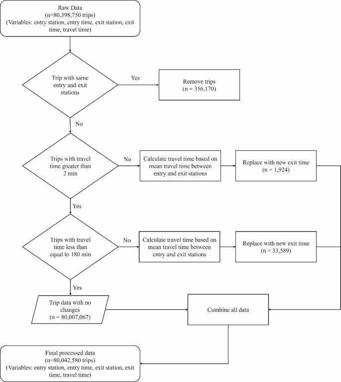
Data preprocessing workflow for AFC system records of the Delhi Metro.
Built environment data
The categorisation of PoIs includes 12 distinct types, as outlined in Table 1, which also provides detailed descriptions and subcategories for each type. The data, sourced from the National Capital Region Planning Board (NCRPB) and OpenStreetMap (OSM), underwent a deduplication process to consolidate overlapping categories. Multiple subcategories with shared characteristics were grouped into the 12 categories presented in Table 1. These PoIs were collected within a 1200-metre radius of metro stations, selected to capture the immediate urban catchment area influenced by metro accessibility34. This radius was chosen to ensure the inclusion of key amenities and services supporting transit-oriented development. While studies such as Chen et al.35used a 500-metre radius for PoIs, a larger radius was considered for Delhi to account for places accessible not only by walking but also by paratransit feeder modes such as autorickshaws. The PoIs were extracted from the data sources in July 2024. While any aggregation of dozens of raw OSM/NCRPB classes into 12 umbrella types necessarily requires judgment, our scheme closely follows the native OSM feature hierarchy and the NCRPB land-use taxonomy, grouping only those subcategories with clear functional affinity (e.g. cinemas, restaurants and theme parks all under “Leisure,” schools and colleges under “Education,” etc.). To maximize transparency and reproducibility, the full mapping from original subcategories to our 12 types is provided in Table 1.
The dataset encompasses a total of 74,530 PoIs within the 1200 m buffer of 237 stations, distributed across categories such as Banking (26,596), Health (4,023), Hotels (960), Industry (132), LIG Housing (763), Leisure (8,734), Open Space (7,681), Public Utility (10,681), Shopping (5,023), Parking (155), Education (6,900), and Bus Stops (2,882). This categorisation provides a structured view of urban functionality, supporting comparative analysis of metro station surroundings. Figure 3 shows the distribution of PoI density and categories across Delhi. However, it can be observed that if only NCRPB data were available, the PoI counts would be significantly smaller due to its limited coverage. Nonetheless, it is assumed that such missing data is randomly distributed across stations, making the dataset suitable for comparative analysis. Additionally, certain PoIs, such as shopping malls, could fit into multiple categories like Shopping and Leisure; however, for simplicity, they have been assigned to a single category. Other limitations include potential inaccuracies in the data sources and variability in the granularity of mapped PoIs, which might affect the comprehensiveness of the analysis.
The density considered in this study represents the total number of PoIs per unit area within the buffer zone (in km2). Meanwhile, entropy is calculated using the Shannon entropy formula and is represented as:
$$\:{H}_{s}=-\sum\:_{i=1}^{n}{p}_{is}ln{p}_{is}$$
(1)
where,
\(\:{H}_{s}\)= Shannon entropy for station \(\:s\),
\(\:n\)= number of PoI categories with nonzero counts,
\(\:{p}_{is}\)= proportion of PoIs in category \(\:i\) at station \(\:s\), calculated as:
$$\:{p}_{is}=\frac{{x}_{is}}{{\sum\:}_{j=1}^{n}{x}_{js}}$$
(2)
where, \(\:{x}_{is}\) is the count of PoIs in category \(\:i\) for station \(\:s\). For this study, PoIs were classified into 12 categories (\(\:i\)), including Banking, Health, Hotels, Industry, LIG Housing, Leisure, Open Space, Public Utility, Shopping, Parking, Education, and Bus Stops.

Points of Interest (PoI) categories and density across metro stations in Delhi. (The figure was created using ArcGIS Pro version 3.1.0 (Esri Inc., https://www.esri.com)). The basemap sources include Esri, DeLorme, HERE, and MapmyIndia.
Apart from PoI data, we utilised Meta’s RWI data, which provides a standardised measure of regional wealth based on indicators such as digital ad engagement, device usage, and higher education proportion31. The RWI data is used as a proxy for economic indicators around the station, as it is well established that wealthier regions often have better infrastructure and services, leading to higher transit demand36. Additionally, we considered intersection density, which reflects the degree of street connectivity around each station. Higher intersection density typically indicates a more walkable environment, which can facilitate better access to transit and influence ridership patterns.
The primary objectives of this paper are to explore the relationships between BE variables and the contribution of each station to link-level crowding. Figure 4 presents the methodological framework adopted in the paper. This framework includes the calculation of link-level flows using trip data from AFC and the link network derived from GTFS data. These link-level flows are then used to calculate the hourly station-level contributions, i.e., the CCI. Finally, a statistical model is estimated to evaluate the impact of BE variables on CCI. Additionally, the impact of time of day (peak vs. non-peak hours) and day of the week (weekday vs. weekend) was also evaluated. This section elaborates on the methodologies adopted in this study.
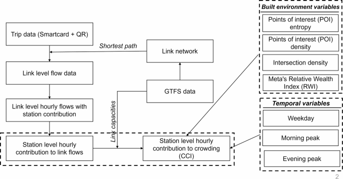
Methodological framework adopted in the study.
Link level flow
The cleaned AFC dataset comprised 80,398,750 trips, capturing detailed entry and exit information, including timestamps and station identifiers. This data was integrated with GTFS data to construct a transit network graph using the igraph package in R37. GTFS data provided essential structural details by linking stops, routes, and trips through sequence data and travel times. Stop times were processed to calculate travel times between consecutive stops, which were then used to create weighted edges representing connections within the network. These weights, based on average travel times enabled the evaluation of the most efficient transit paths between stations. The resulting directed network facilitated the calculation of shortest paths for each pair of entry and exit stations.
A shortest path function, based on Dijkstra’s algorithm, was used to compute the path between entry and exit stations by considering the weights assigned to each link. The total travel time, calculated as the difference between the entry and exit times, was distributed across the links proportionally to their respective weights. It is important to note that this process does not account for the time travellers spend walking from the AFC gate to the train at the entry station or from the train to the gate at the exit station, which is a limitation of the adopted method. We recognise that distributing trips via a deterministic shortest-path (Dijkstra) assignment neglects route-choice variability, intermediate transfers, and time-dependent effects such as train bunching or platform queuing. However, on the high-frequency, predominantly radial Delhi Metro network, most passengers naturally follow minimal-time itineraries and alternative routings are limited. Using GTFS-derived link weights and a shortest-path algorithm thus provides a pragmatic, computationally efficient first–order approximation for very large AFC datasets to link-level flows. Each trip is then represented as a series of links, capturing details such as start and end nodes, travel times, and associated temporal information (entry and exit times). The process generated 1,129,220,894 individual links, representing detailed connections within the transit network. The resulting output is a comprehensive link-level dataset, enabling a granular evaluation of transit performance and user behaviour. Future work will extend this with probabilistic assignment models and explicit treatment of transfer and walking times.
Crowding contribution index (CCI)
The generated link-level information is then utilised to create an hourly link-level flow dataset. This dataset consolidates the link-level flows for each hour, day, and link (\(\:{F}_{lhd})\). Additionally, the dataset calculates how this hourly link-level flow is distributed across each station \(\:\left(s\right)\) based on their destination locations. Subsequently, the flow ratio \(\:{(r}_{slhd})\) is calculated, which determines the proportional contribution of a station’s flow to the total flow on a link during an hour on each day. For each station and link, the ratio is calculated as the flow on each link with the destination station \(\:s\) divided by the total flow on the link, but only if the total flow exceeds the link’s capacity (\(\:{C}_{lhd}\)) during the given hour and day. The link capacity is derived from GTFS data, assuming 200 people per car and 6 cars per train. This assumption is considered reasonable, as also identified by the DMRC38. If the total flow does not exceed the capacity, the station’s contribution is set to zero. This ensures that the calculation focuses on crowding conditions where capacity constraints are exceeded, capturing the relative impact of each station on link-level crowding.
$$\:{r}_{slhd}=\left\{\begin{array}{c}\frac{{f}_{slhd}}{{F}_{lhd}},\:if\:\:{F}_{lhd}>{C}_{lhd}\\\:0,\:\:Otherwise\end{array}\right.$$
(3)
Where,
\(\:{f}_{sl}\) = Flow on link \(\:l\) with destination at station \(\:s\) during hour \(\:h\) on day \(\:d\).
\(\:{F}_{lhd}\) = Total flow on link \(\:l\) during hour \(\:h\) on day \(\:d\).
\(\:{C}_{lhd}\) = Capacity of the link \(\:l\) during hour \(\:h\) on day \(\:d\).
\(\:{r}_{slhd}\) = Ratio of the flow with destination station \(\:s\) to the total flow on link \(\:l\) during hour \(\:h\) on day \(\:d\).
Crowding contribution index for a station \(\:{(CCI}_{shd})\), represents the average contribution of all link flows directed toward a specific destination station \(\:s\) during a given hour \(\:h\) on a given day \(\:d\). It is calculated as the mean of the flow ratios \(\:{(r}_{slhd})\) for all links that contribute to the destination station \(\:s\), where the total flow on each link exceeds it capacity. Equations (3), (4), and Fig. 5 illustrate the calculation process for \(\:{CCI}_{shd}\). By aggregating the flow ratios of links directed toward \(\:s\), the \(\:{CCI}_{shd}\) quantifies the degree to which these stations contribute to potential crowding at the link-level during specific time intervals.
$$\:{CCI}_{shd}=\frac{1}{\left|{L}_{hd}\right|}\sum\:_{l\in\:{L}_{hd}}{r}_{slhd}$$
(4)
where,
\(\:{CCI}_{shd}\)= Crowding contribution index of station \(\:s\) during hour \(\:h\) on day \(\:d\).
\(\:{L}_{hd}\)= Set of links during hour \(\:h\) on day \(\:d\) where \(\:{r}_{slhd}\ne\:0\).
\(\:\left|{L}_{hd}\right|\)= Number of links with non-zero contributions for station \(\:s\) during hour \(\:h\) on day \(\:d\).

Illustration of the process for calculating the Crowding Contribution Index (CCI).
While this study primarily examines the role of destination stations in contributing to link-level crowding, origin stations also play a significant role in shaping congestion patterns. Although crowding physically accumulates from boarding events, attributing link-level overcapacity flows to destination stations allows us to tie crowding back to the built-environment around trip ends. In other words, by measuring “which station’s draw” pushes a link beyond capacity, the CCI becomes an explanatory lens for how BE factors drive crowding dynamics, rather than a literal account of where passengers board. This station-level attribution offers planners actionable targets (e.g. where to add rolling stock or adjust headways) even if it abstracts away detailed load-propagation mechanics. Additionally, this study defines overcapacity crowding using a threshold based on capacity (\(\:{C}_{lhd})\). This threshold can be adjusted if policymakers are interested in identifying only extreme overcrowding. In such cases, it could be set to twice the capacity or another suitable value to reflect more severe congestion conditions.
A major limitation of this work was that we lack direct AVL or on-board load measurements for the Delhi Metro. Instead, we derive link capacities from GTFS (200 pax/car, 6 cars/train, per DMRC guidelines) and focus on passengers exceeding those thresholds. By framing CCI as a relative measure, i.e. the share of “overcapacity” flow attributed to each destination station, we mitigate systematic biases in absolute load estimates. While AVL-based validation would strengthen empirical credibility, the CCI’s comparative nature ensures robust station-level insights even when only AFC and GTFS data are available. Crucially, this CCI methodology is designed as a flexible framework, it can be readily extended to incorporate probabilistic transit assignment, intermediate transfers, and AVL-derived occupancy data in future studies.
Regression analysis
To investigate the relationship between BE factors and CCI, we employ a comparative regression framework that compares classical econometric techniques with Machine Learning (ML) methods. This approach addresses limitations associated with traditional parametric models in capturing complex, nonlinear interactions and potential spatial dependencies associated with BE factors influencing public transport crowding. Initially, a Type II Tobit (sample selection) model39 is utilised due to its ability to correct for potential selection bias arising from observing CCI only for those station-hour instances contributing to crowded links. This method involves jointly estimating a Probit selection equation indicating whether a station contributes to crowding, and an outcome equation predicting CCI conditional upon selection. The model is estimated using a Maximum Likelihood Estimation (MLE) approach, jointly estimating the selection and outcome equations.
To capture more complex, potentially nonlinear interactions among variables, we also incorporate multiple ML algorithms into our analysis: Ordinary Least Squares (OLS) regression, serving as a baseline linear benchmark; Ridge and Lasso regression methods, which introduce L2 and L1 regularisation, respectively, for handling multicollinearity and enabling feature selection40; Random Forest, an ensemble decision-tree method known for robust nonlinear modelling capabilities41; and Extreme Gradient Boosting (XGBoost), a gradient-boosting framework noted for its high predictive performance and effectiveness in modelling intricate data structures42. Such ML approaches have shown promise in recent urban and transportation studies, particularly in capturing nonlinearities associated with travel demand and behavioural patterns43,44.
The dataset was randomly divided into training (80%) and testing (20%) sets. All regression and ML models were trained using the training subset, with out-of-sample predictive performance evaluated using the held-out test set. Hyperparameter tuning for ML algorithms was conducted through three-fold cross-validation on the training data, selecting parameter combinations that minimised the cross-validated mean squared error (MSE). The tuned hyperparameters and their corresponding candidate values are summarised in Table 2.
Table 3 provides a concise overview of all variables included in our analysis, spanning the dependent CCI metric, built-environment attributes, and temporal variables. Additionally, it is to be noted that CCI is handled differently across methods: in the Tobit framework it is split into a binary selection and a continuous outcome component, while in the machine-learning models it is used directly as a continuous regression target.